VOXABOT: PLATFORM FOR QUICK TEXT-TO-SPEECH EDITING
A 5-step design strategy focusing on user experience that helped Voxabot, a TTS Editing Platform grow its organic traffic by 71% in a month.
The Business Needs
Understanding what Voxabot was looking for.
They wanted to work with a Laravel development company that could design with their existing website design & a few features to make it even more value-adding. As they offered TTS editing services, the user experience was a significant aspect of their website. They wanted to ensure the users had a seamless experience on the website. In simpler words, the client wanted to make the site highly user-friendly and dynamic.
All these goals encouraged Voxabot to hire Laravel developers that can:
- Design the UX and UI of their website
- Develop multiple CMS pages for the site
- Integrate a payment gateway into the website
- Account role setup for users
- Design and develop various new web pages
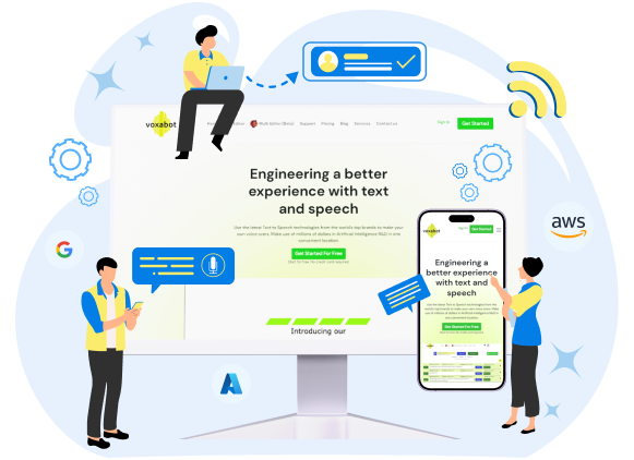
About Voxabot: Voxabot is a TTS editing platform helping businesses improve the quality of their text-to-speech outputs. Voxabot users can use the latest TTS engines of Google, AWS, and Azure. The platform enables its users to edit files with great accuracy and control over each word and syllable, making it one of the world’s most reliable and high-quality TTS editing platforms. The brand aims to make TTS outputs sound natural as delivered by humans.
Our Approach
What approach did we take with the project?
The core service delivery of the client was a TTS editing service to help businesses elevate the quality of their TTS script. It relied on three of the best TTS engines in the world, such as Google, Azure, and AWS. It works with over 150 languages and dialects. Voxabot allows its clients to use different speakers for each language—over 850 voices. The platform needs to be seamless as the users need to constantly interact with the platform to make the TTS files accurate and voices natural.
Although we had quickly understood the vision and design philosophy that Voxabot wanted to go with, we decided that we must engage with the client to understand each aspect of their website. Therefore, we interacted with them to deeply understand how each element works on the website. This helped us fill the design gaps the client needed to be aware of. That detailed understanding also helped us to understand what precisely the client was looking for, what issues they were facing, and how the competition was doing in the field. Once we got enough unique details from the client, we filled up the picture thanks to our experience in offering UI/UX design services.
Based on the details we got from the client, we conducted extensive market research to understand the issues that businesses and users faced. This further helped us get a more comprehensive understanding of the industry’s status and the opportunities we have as a Laravel development company.
The next phase involved creating a strategy for the project execution and the methodology we would adopt. As we have experienced tremendous success with agile methodology, we also decided to go with the same for this project. To execute the project successfully, we created a team of designers, marketing strategists, Laravel developers, etc. With this, we were ready to start the project.
Solution
What was our solution to the client’s goals?
During our research, we know that design must be the first element to tackle in this project. Hence, we focus on creating the most impressive user experience for the users. Our UI/UX designers worked on the design first based on the client’s inputs. To ensure that the site was highly functional and fast and helped users with easy navigation, each element was seamlessly integrated into the existing design. This was a conscious effort our UI/UX designers made to make the site fast and accessible for everyone.
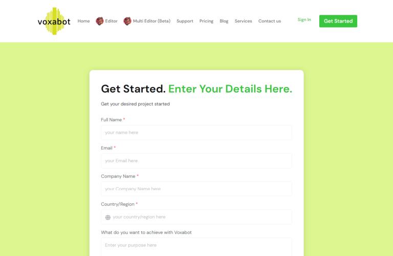
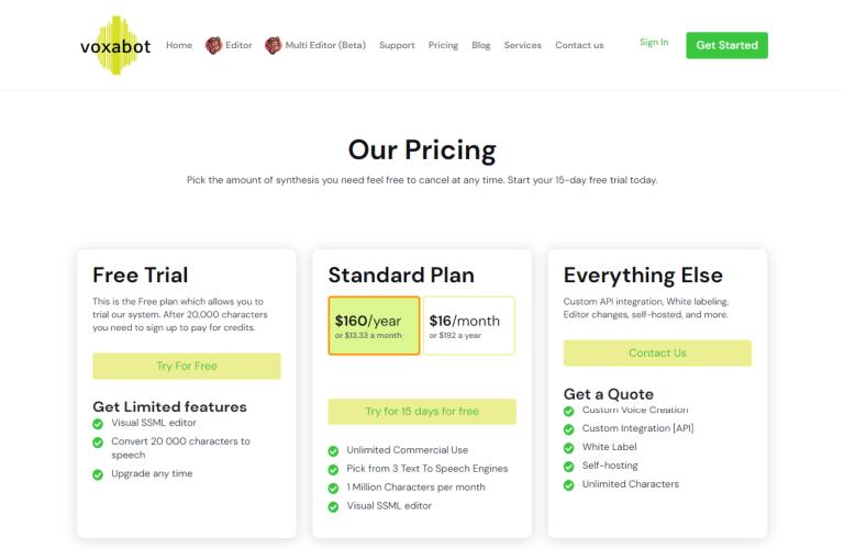
Once we set the final design, we moved to the development part. According to the client’s requirements, we used PHP/Laravel to create the backend for each section and feature the client required. We developed CMS pages, such as blogs, support, etc., to make the website more useful to visitors. We also created the pricing page, profile page, and sign-up/sign-in pages for the website. As the client wanted to process payments on the site, we also integrated the Stripe payment gateway into the site. Thanks to our experienced Laravel development team that helped us to deliver the development phase in a defined timeframe.
At the end of the project, we were successful at creating a site that has:
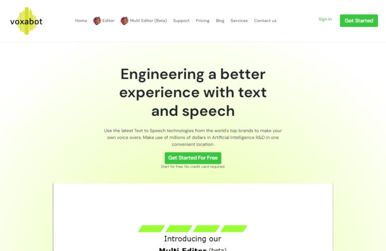
- An impressive and seamlessly dynamic home page
- A powerful and easy-to-manage CMS integration
- Account creation and management capabilities
- Well-optimized and user-friendly blog page
- Support page that is easy to navigate and search
- Well-designed and helpful pop-up pages
Striking Features
As the client wanted to deliver their visitors a feature-rich experience on their website, we added the following features to the site:
Screenshots
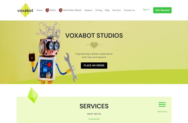
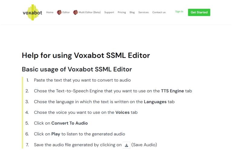
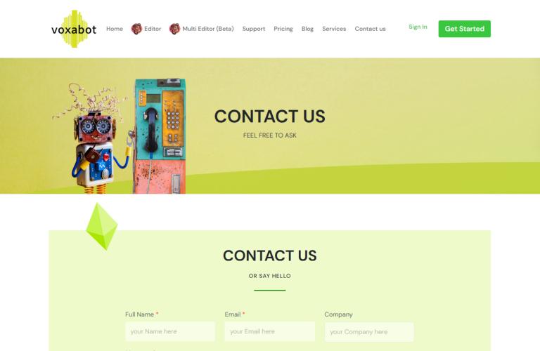
Take a look at the screenshots of the website we have developed.
Clients Speak-Stories from our Clients
The client shared ecstatic feedback with us
Final Outcome
After developing the website, the client shared the following updates with us.
Once the website was launched, the client observed improvement in all key performance metrics, such as sales, site sessions, and traffic. Apart from sales, the site also experienced more engagement in the newly launched web pages.


