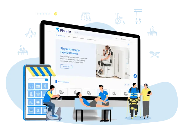
FISUNIC: SELLING/RENTING PHYSIOTHERAPY EQUIPMENT
How AddWeb Solution’s strategic and streamlined approach to developing a feature-rich eCommerce site has helped Fisunic establish its brand presence quickly.

The Business Needs
Figuring out what Fisunic was looking for.
A Spanish eCommerce brand, Fisunic, was looking for a Laravel development company to develop an eCommerce website for them. They wanted to sell and rent physiotherapy equipment to the customers. As people are online and want to order products from their living rooms, Fisunic wanted to develop a website that they can use to sell and rent their products. This was the major reason they were looking for a reliable eCommerce portal development company.
They wanted a highly functional and feature-rich eCommerce website that could make buying and renting physiotherapy equipment quicker and faster. Hence, they needed the site to be fast, intuitive, and easy to navigate.
In short, Fisunic wanted to hire a Laravel development company that could:
- Develop an exceptional eCommerce website for their business.
- Craft the website from the ground up, taking care of all aspects.
- Integrate a reliable payment gateway to enable online payment.
- Make the eCommerce site easy to navigate and buy products.
- Help them add products and their details easily to the website.
About Fisunic: Fisunic is an eCommerce business selling and renting physiotherapy equipment for those who need it. Their primary offering is physiotherapy equipment that people need as part of their ortho-care requirements. The business makes it easy for people to buy physiotherapy equipment from them per their needs. If the customers do not need the equipment permanently, they can rent the equipment for a monthly subscription. As part of its business expansion strategy, the business wanted to develop an eCommerce website that could serve as the focal point of its online sales strategy.
Our Approach
How our Laravel development team approached the project.
Our primary aim was to learn the business goals and expectations of the client. As the only way to do this was to interact with the client, we scheduled many interviews and interactions with their team. With each interaction, we understood that the client wanted a feature-rich and powerful eCommerce site that makes buying and renting physiotherapy equipment easy for their users. We got various insights from the client, and we decided to integrate these strategically into the project’s planning. Our Laravel team quickly understood the assignment thanks to the experience in working on diverse similar projects.
However, we wanted to deliver an impeccable website that delivers a flawless user experience for their users. Hence, we decided to conduct extensive research to understand the industry. The research made us understand the overall stylistic trend, preferences of the users, and the design philosophy that works in the industry. In addition, we also looked at some of the top-performing competitors of the brand to ensure that the client’s website has a competitive edge.
The next phase was to assemble a team after gathering all the insights we needed to start working on the project. According to the project’s requirements, we constituted a team comprising Laravel developers, eCommerce strategists, top designers, a project manager, etc. We also created an action plan outlining how the project will be executed.
The Solution
How AddWeb Solution delivered the eCommerce website for the client.
Once we learned about the client’s goals and the industry’s expectations from an eCommerce website, we moved on to start working on the project strategically. We decided to nail down the design and then move to the development part, as that’s the logical way to proceed. Our designers quickly got on with the project and created three design iterations that we thought would work perfectly for the client’s website. After the call with the client, we chose one design and made a few changes per the client’s request.
Now, the biggest part of the project was remaining—developing the eCommerce site. Our team chose the Laravel framework and Bagisto for developing the eCommerce capabilities of the site apart from using the Bootstrap theme for the website design. As the eCommerce site needed a payment gateway, we integrated PayPal due to its reliability and features into the site.
Everything we did for the project was strategically planned and executed, which helped us reduce the time needed to develop the website. This also helped us deliver the project weeks before the agreed deadline.
Striking Features
Features that we added to the website to ensure its performance.
Clients Speak-Stories from our Clients
What feedback we got from the client after the project.
Final Outcome
The client returned to us to share their website’s growth after three months of its release.
The site began receiving good impressions and clicks after a week of its release. And the number of users increased constantly thanks to the site’s intuitive design and ease of use. While the business could sell a few products, it was not very substantial in the first month. However, in the second month, the sales went up by 329% from the first month.


