Talking about the earlier website development, designers were speaking the language of “Page-Centric” design.
“What will be there on the home page?”
“What will be the number of pages on a website?”
“How about the service page? will it look decent with X design?”
And the questions go on and on when it comes to website development.
The days are gone to think about designing a website that is centered around static pages. Modern user interfaces are increasingly expected to become more elastic in the sense that they are used extensively by the users on a variety of devices. UI and UX consultants working on the website development need to think about encapsulating larger user interfaces into self-sustained components making up a user interface at the micro-level. And that’s where component-based UI development comes into the picture.
Component-based UI empowers website development teams or UX consulting services providers with more efficiency, consistent GUI, and ease of maintaining any website. It can be of great use when you are playing with large web applications where plenty of UI elements are supposed to be maintained at a time. In this post, we are going to discuss how businesses and website design companies can leverage component-based UI development.
Related Reading – Importance of UX design for enterprise applications
Let the team works in a collaborative way
With the help of component-based development, UI and UX consultants can work in a more collaborative way. It enables a clear breakdown of the department and lets the developers and designers communicate more effectively to deliver better. Approaching website development in an incremental way makes it easy for the website design company to incorporate features in a more strategic and collaborative way.
Improves Efficiency
Component-based UI development encourages the team to design and develop components in a way that makes it easy for the website development company to reuse them in an efficient way. It becomes very easy for newbie developers or designers to understand the code. With a component-driven UI approach, components are documented well and shared with cross-teams, which helps them code faster and eliminate any possible delay. This way, the efficiency of the entire team is improved.
Enable sense of Ownership
Lack of ownership and commitment to design a website or application is a major problem in a website design company, specifically in distributed teams where individuals are required to work together. While executing large website development projects, UX consulting services often split work into different teams. This often leads to confusion and communication breakdown. However, component-driven UI development leads to ownership of work and commitment to deliver quality user interfaces.
Visible Consistency
One of the major problems with website design is the lack of consistency in terms of designing. If you take an example of Atlassian, they had more than 60 different types of drop-down menus created by their development due to lack of centralizing front-end code. In the end, the user experience was heavily impacted. With the help of component-based UI development, it becomes easy for the designers or developers to have a centralized repository for the front-end code. This enables the team to build consistent designs without hampering the user experience. Moreover, it helps businesses to boost loyalty and customer satisfaction due to consistency in the design.
Also Read – Hiring Remote Developers in India and Getting Same Productivity
Boost team Scalability
Not all the UX consulting services providers have a dedicated team of designers available to work only on the front-end portion. Many times, a developer is required to carry out the front-end design part. In such events, the component-driven UI approach greatly helps the developers. With the help of proper documentation, the design and development process becomes very easy for the small design consultancies. This, in the end, helps them scale their business without any hiccups.
Atomic design
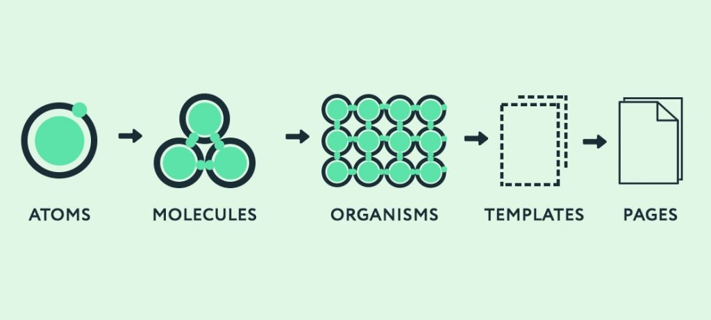
Atomic design is a method for different stages working together to create interface design systems in a more deliberate and hierarchical manner. In simple words, we can define that Atomic design is a methodology to break a website layout down into its very basic components, which are reusable throughout the site. The hierarchy of Atomic design is built up of five stages; each stage is made of a group of components from the previous stage.
There are five components which are used to create the Atomic design:
- Atoms
- Molecules
- Organisms
- Templates
- Pages

Atoms:
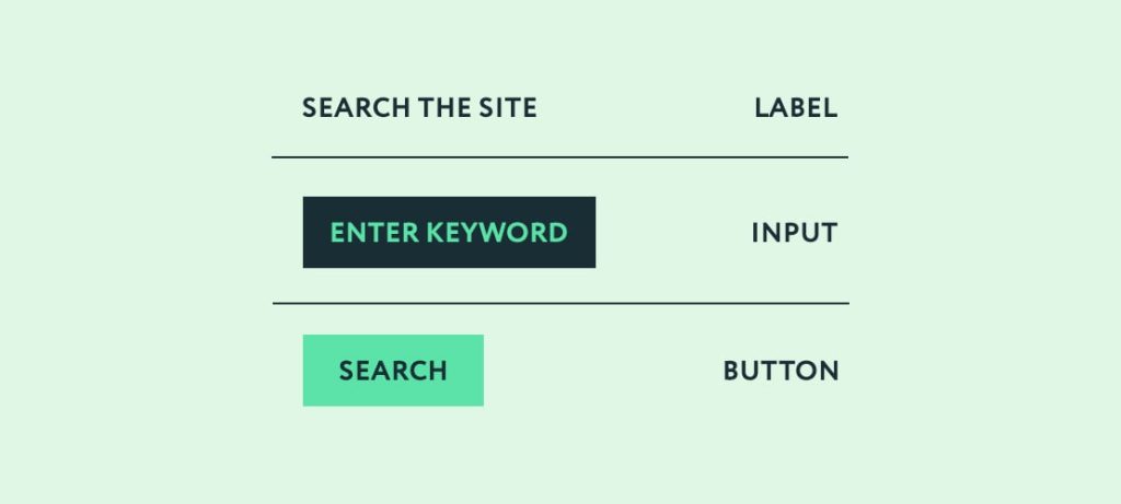
Atoms are basic building blocks of HTML such as a button, textbox, labels, etc. It can include more abstract elements like color palettes, font size, and a visible interface like animation. Each Atom has its own unique property, and these properties influence how each Atom will contribute to the overall user interface.

Molecules:
When we start combining Atoms together, then the next level of the hierarchy is created, and it takes the shape of Molecules. It means Molecules are groups of Atoms pieced together to take the smallest unit of function. These molecules take on their own properties and work as the backbone of design systems.
For example, Label, textbox, and button are combined together to create a form.

These types of molecules are functional and reusable components that can be simple or complex.
Organisms:
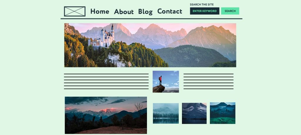
In our design system, the third stage is ORGANISM, and it is a group of molecules where a group of elements creates different sections of an interface. Organisms can have similar and/or different types of Atoms & molecules(component). We might not be interested in the molecules of a design system, but with organisms, we can see the final interface beginning to take shape like header, footer, etc.
For example, Header is an organism in the interface, containing various elements like images, buttons, and components like navigation & Search, etc.

Template:
A template is a combination of Organisms. It is a page-level object. The main contribution of a template is that it defines the content structure. It is a system of the page where different sections and components work together to create a layout and structure.
For example, Header, a text section, image gallery, form, and many more components combine together to create a homepage template.

Pages:
And at-last the final comes pages. Pages are specific instances of templates. The template gets respective content for the pages. That shows how Page will look like with real content in place.
For example, Take the home page template and replace the placeholder images with Real images and content to show the page.

Why Consider Atomic Design?
Following Atomic Design principles can have major benefits for your workflow. Here’s how.
- Able to create a simple style guide
- Easy to adopt one component into another one like mix and match components
- Easy to understand the layout
- Code is more consistent
- Easier to update and remove any component/part into the site
- More modular file structure
Conclusion
When we started work for Atomic design, at the starting point of implementation, it required extra effort, but in a long way, it reduced our effort, and it pays off for all. We don’t need to create a bunch of pages. Because we created a design system, and this design system is fully documented with proper flow, so we can use this design system in many projects.
Frequently Asked Questions
Component-based UI development is an approach where user interfaces are built by assembling independent, reusable components. This differs from traditional approaches where interfaces are created using monolithic structures. Components offer modularity, reusability, and easier maintenance.
Component-based development allows developers to create reusable and self-contained components. This reusability not only speeds up development but also ensures consistency across the website. Changes made to a component reflect universally, reducing redundancy and saving time.
In component-based development, UI elements are encapsulated into modular components. These components can be reused across different parts of a website or even in other projects. This promotes consistency and efficiency by avoiding the need to recreate similar elements.
Components are self-contained and independent, making them easier to manage. If changes are needed, developers can update the component, and those changes automatically reflect wherever the component is used. This simplifies maintenance and reduces the risk of errors.
Yes, component-based development is highly adaptable. As design requirements change, developers can update or replace individual components without affecting the entire website. This flexibility ensures that websites can easily evolve to meet changing design trends and user expectations.
Component-based development promotes collaboration by allowing different teams or developers to work on specific components independently. This parallel development accelerates the overall process, and teams can focus on building and improving specific elements without stepping on each other’s toes.
Yes, component-based development aligns well with responsive and mobile-friendly design. Components can be designed to adapt to different screen sizes and resolutions. This ensures a consistent and optimal user experience across various devices.
Yes, one of the key advantages is the ease of integrating existing components into new projects. This accelerates development by leveraging pre-built components, maintaining consistency, and ensuring that proven elements are reused across projects.
Component-based development contributes to a better user experience by ensuring consistency in design and functionality. Reusable components maintain a cohesive look and feel, and any improvements or optimizations made to components positively impact the entire website.
