

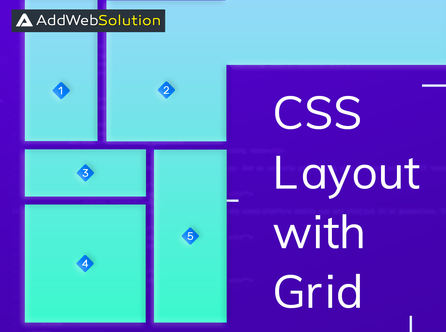
A perfect world may be a myth, but not a perfect website design. Yes, that’s true. A perfect website design is a perfect blend of creative mind and innovative design tools. At AddWeb Solution, we have been mastering this art for years and have finally found our a few key-rules and techniques that can at least help one get a bit to create a perfect design, if not create one. CSS Grid Layout is one such system that plays a vital role in creating a website design that leaves an impression.
What is the CSS Grid Layout?
Well, we exactly know which question might pop up in your mind and when! So, let us answer this base question at first. CSS Grid Layout, as the name suggests, is a two-dimensional grid-based layout system. It transforms the way one designs a grid-based user interface. It simplifies the entire layout pattern into distinguished rows and columns for better understanding.
At one point, when the simple and basic layout complexes the entire process and brings difficulty in solving a few issues; the CSS grid-based layout system is tailored to overcome both the issues brought with the help of rows and columns. One doesn’t need to use floats and positioning anymore with the CSS Grid Layout. Also, the properties of CSS Grid Layout are supported in the majority of modern browsers. So, that also proves to be helpful.
The usage of CSS Grid Layout
The grid layout can be set using the display property, which is used to set the grid / inline-grid on the parent element; while the child element will automatically become grids item. Let us explore more about this, the new CSS techniques and learn about their usage on a more component level. This particular approach also comes with a range of benefits like an amazing and super-easy website layout, reduction of social media queries for handling responsive design, et al.
Defining a Grid
display: grid is a property that creates a block-level grid container and the display: inline-grid; property creates an inline grid container. One can create a grid using the grid-template-columns and grid-template-rows properties.
grid-column-gap property is a set-gap between the columns and the grid-row-gap property is a set-gap between the rows. The grid-gap property is a shorthand property for the grid-column-gap and the grid-row-gap properties.
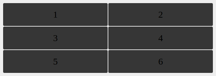
Let us explain this entire concept of CSS Grid Layout by citing an example, for the sake of better understanding.
HTML
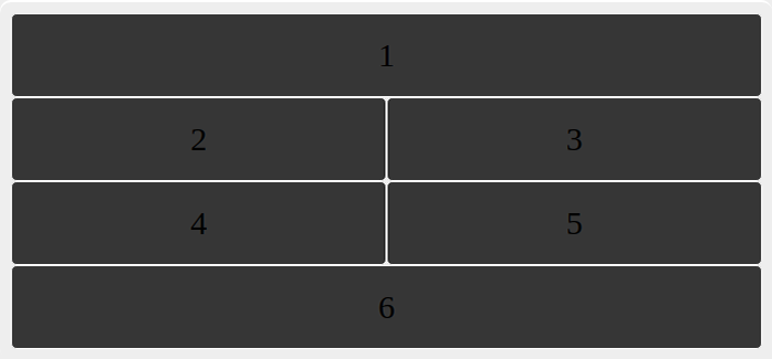
<div class="grids">
<div class="grid-item item1">1</div>
<div class="grid-item item2">2</div>
<div class="grid-item item3">3</div>
<div class="grid-item item4">4</div>
<div class="grid-item item5">5</div>
<div class="grid-item item6">6</div>
</div>
CSS
.grids {
  display: grid;
  grid-template-columns: auto auto;
  border-radius: 10px;
  padding: 10px;
}
.grid-item {
  background-color: #333;
  border: 1px solid #fff;
  padding: 20px;
  border-radius: 5px;
  font-size: 30px;
  text-align: center;
}
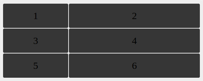
We can change our column width, for example, we can set the first column with 200px and second column with 400px.
.grids {
  display: grid;
  grid-template-columns: 200px 400px;
}
Now we will look at grid-gap.
grid-gap: 25px 15px;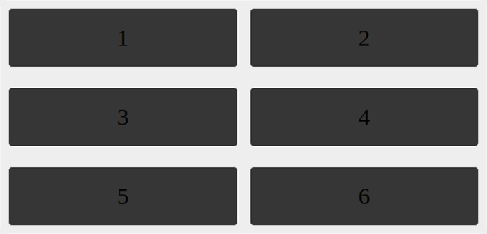
and also we can set it individual property like,
grid-row-gap: 25px;
grid-column-gap: 15px;
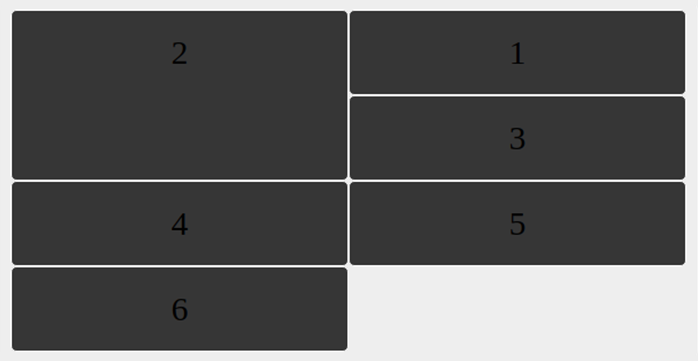
For example, we place our item1 and item6 at column line 1 and let it end on column line 3.
.item1, .item6 {
  grid-column-start: 1;
  grid-column-end: 3;
}
or we can also write even shorter syntax we can do the same with grid-column property.
.item1, .item6 {
   grid-column: 1 / 3;
}
Let’s see at grid-row property.
.item2 {
   grid-row: 1 / 3;
}
and also we can write like this,
.item2 {
  grid-row-start: 1;
  grid-row-end: 3;
}
The grid-area property specifies a grid item’s size and location in a grid layout. Also, the grid-area property is a shorthand property for the following properties:
- grid-row-start
- grid-column-start
- grid-row-end
- grid-column-end
We’ll continue sharing more such informative blogs around CSS and designing in general. Feel free to share your inputs and queries, regarding the same. Because, as they say, “Power is gained by sharing knowledge and not hoarding it”.

Ready to Master CSS Grid? Dive into the Essentials! Learn the must-know techniques of CSS Grid and transform your layouts today.

Pooja Upadhyay
Director Of People Operations & Client Relations