


A well-structured design system’s contribution to a successful project is always significant. Development alone cannot create wonders. It’s only a swift and even-handed collaboration between the two, which helps in attaining the desired goals. Design architecture hence plays a pivotal role in this entire scenario and today, we’ll like to throw some light on this very topic. Hope it might prove insightful to you.
The maintenance of code is deeply taken care of, every time a large-scale application is being built. It is also structured in a very detailed manner. Such things are undervalued when it comes to creating CSS code for the design. To rectify such an error in handling the design architecture, the code can be managed by creating a component-based design.
What is a Component-based Design?
A component-based design is an independent or a small set of components, which can be reused for other designs. Such reusable CSS component does not require any HTML tree structure and is also not dependent on any root element. It’s just by adding an extra class to the existing HTML code that one can create the reusable component code.
Components & Its Elements:
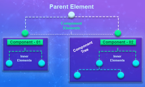
Components are placed in one single place, in order to make the understanding its pattern easy and straightforward. There’s one parent element, which acts as the prime element for all the components. The component class is defined by these component elements, where the actual designing of the component commences. There’re also child elements, which defines the properties that are specifically related to the component parent. A host of such components are attached to the main parent element under this method. Let us share a pictorial design of the entire thing for better understanding:
Principles for a Component-based CSS Design:
Alike any other system, maintaining the system of a component-based CSS design also requires a set of principles. These principles help in generating component, quite easily and effectively. Let us share these principles with you:
- Modular & Isolated Component:
A crystal clear categorization of the components made refers to a component being modular and isolated. No component should be, in any which way, dependent on the other.
- Predictable:
The component and its class name should be relatable and meaningful. The class name should also be simple to avoid any form of confusion in understanding the type of the component.
- Short & Simple:
The selector strings that are long should be strictly avoided. It’s always advisable to keep them short and simple.
- Avoid Conflicts:
The name of the component should also not be similar to any other components available in the library, in order to avoid any form of conflicts. It should be unique and in accordance with the style guide.
- Naming Conventions:
Classname can be used as a prefix while naming the conventions. The prefix name can also be used in naming the application.
Let us give a demonstration to help you understand that how a component can be named. The CSS code of the same should be written for only that component:
Example:
Card component
<div class="aws_card large">card.scss file:
  .aws_card {
    /* initial code */
    ...
    ...

    /* internal states/ child element */
    .aws_card-header {
      ....
    }

   .aws_card-body {
      ....
    }

   .aws_card-footer {
      ....
    }

    /* variants */
    &.large {
      ...
    }

    /* media query */
    @media(...) {
      ...
    }
  }
File Organization:
As we are about to conclude the blog, let us also share some insights related to the structure directory. Each and every file should be placed in one specific directory. An appropriate file name should be given so that everyone can easily understand the CSS code by just having a glance at it. This also helps them in understanding the purpose of creating the scss file.
_base.scss is global base styles for element selectors only. These are used in an application.
_animation.scss is used to hold all animation effect styling, which is also used in an application.
_header.scss or _footer.scss is used to define header and footer code by its name. They also provide other file names, just as it is done in the above-given example.