LAKRITSROTEN: SWEDEN-BASED LICORICE PRODUCTS PROVIDERS
How AddWeb Solution helps Sweden-based licorice products providers to develop a feature-rich eCommerce platform from scratch.
The Business Needs
Engaging, Seamless, and Aesthetic User Experience.
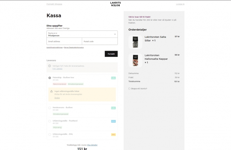
Lakritsroten aimed to create a unique digital experience for their customers that elevated the shopping experience to the next level by ensuring ease of shopping and navigation. The client was looking for a perfect harmony between aesthetics and ease of use, which we agreed on as the objective of the ecommerce platform was to sell its products. Lakritsroten also needed to ensure the safety of the user data and top-notch payment processing technologies to make the users confident about purchasing and sharing their payment details on the site.
About Lakritsroten: Lakritsroten is, first and foremost, an experience store—both online and offline. The brand brings a wide variety of sweet and savory products made from licorice and licorice roots to people who love it. At Lakritsroten, the brand creates a unique shopping experience that does not stop at merely buying a product but also learning about the craftsmanship and inspiration behind every product.
Our Approach
An Insider Look Into What We Did For The Client to Exceeding The Client’s Expectations.
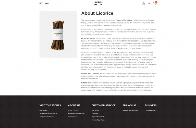
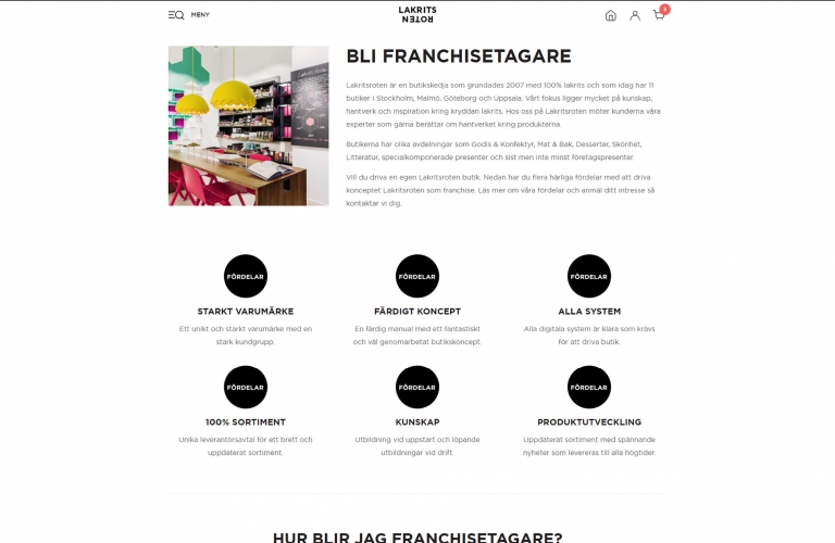
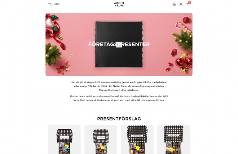
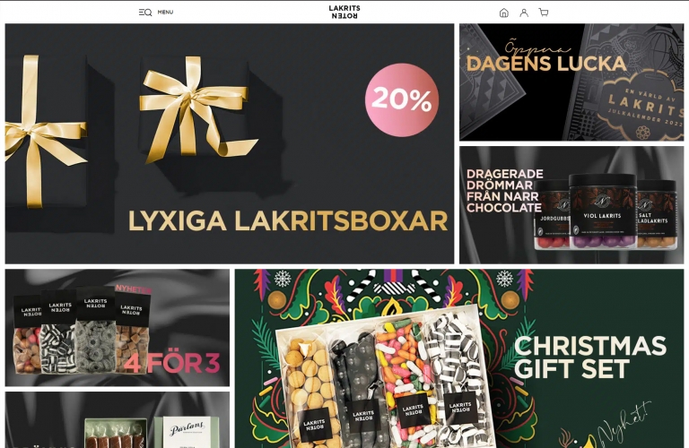
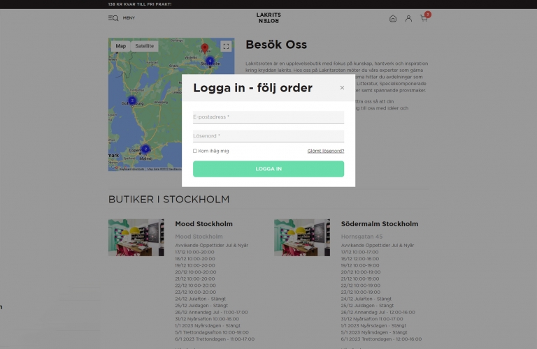
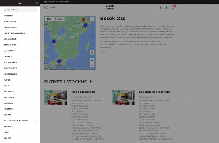
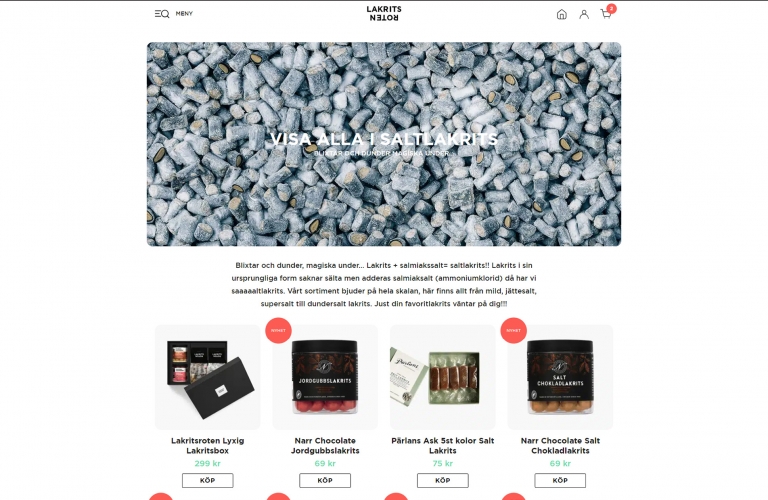
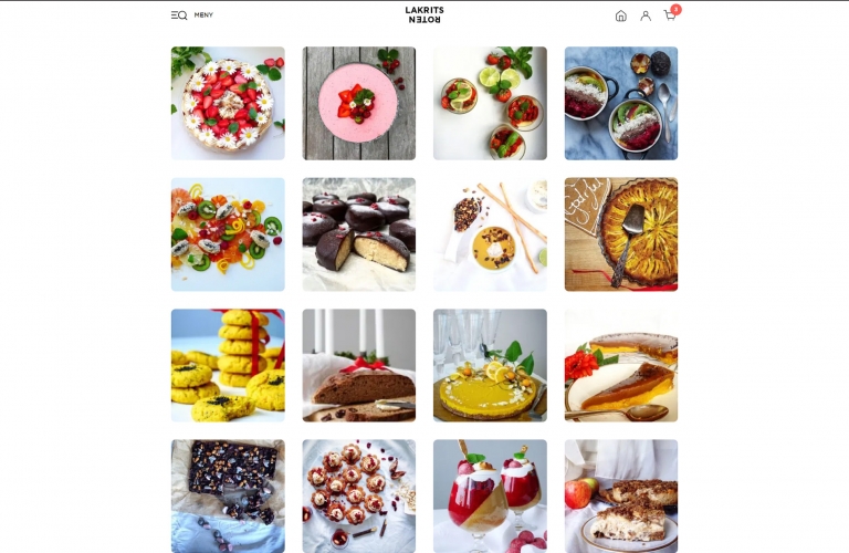
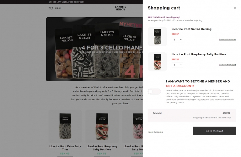
At AddWeb, we decided to go with an aesthetic-first, visual language for the entire website as the portal dealt with selling eateries in rich colors and hues to entice users. We also made it easy for the users to interact with the products and fine details and compare them with each other. In addition, we also included various store details of the brand for customers who love to walk into the stores in their neighborhood. The client found our approach impressive, as they were looking to work with an established eCommerce store development company that could help them bring their vision alive.
AddWeb Solution is extremely proud of the approach we adopted with this food portal development, as we exceeded all client expectations. We decided to brainstorm design and development ideas since the client wanted to build the website from the ground up. Each client’s unique needs was considered as we were brainstorming, and we defined the tech stack, skills, and schedule needed to make it a reality.
Our comprehensive and mature approach, considering everything the client needs, also anticipated the users’ experiences on the site. Our team worked quickly and as per the client’s tight schedule to ensure that Lakritsroten could experience the brand’s legacy and unique marketing positions online on their eCommerce store.
Solution
How we tackled the project using our tech expertise and industry knowledge.
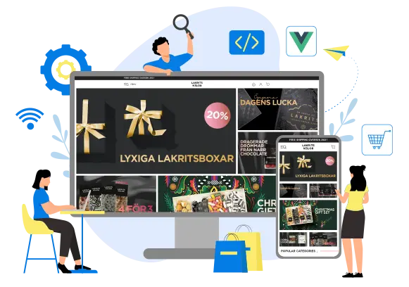
As Lakritsroten approached AddWeb’s eCommerce development team, we found the project quite unlike anything we had done before. The client’s focus was chiefly on creating an online experience store much like their offline stores. Our eCommerce store development team used a custom design and development philosophy based on the Vue Storefront theme provided by the client for the eCommerce site. As Lakritsroten wanted to expand its business presence and customer base using an eCommerce site that could serve its customers in every possible way, we realized that a custom approach is the best. We knew that Vuejs development was the key to it.
The client had already settled on the theme they wanted to go with. Still, our eCommerce development team convinced them to use a few customizations to ensure an uncompromised user experience. Our team worked on the design and development from scratch, leveraged the possibilities of CSS, and used strAPI to bring in diverse design changes.
Combining the vision of the client and AddWeb’s extensive industry knowledge and technical expertise, it was sure that the outcome would be beyond impeccable.
Striking Features
We integrated the following features to make the website easier to use, navigate, and buy products.
eCommerce Store Screenshots
Clients Speak-Stories from our Clients
Check out what our client says about our work.
Final Outcome
How the requirements of Lakritsroten came alive with the help of AddWeb Solution
At the end of the project, the eCommerce website was as aesthetically pleasing as it was easy to use for users and manage for web admins. Users can now easily navigate the website to find and buy their favorite eatery made from licorice. The website is integrated with powerful technologies and online capabilities, so it can be easily accessed on multiple hand-held and computer devices without compromising user experience.
After making the website live, Lakritsroten has seen a surge of users by 85%. The sales have also gone up to an impeccable 65%. In addition to this, they have been getting a tremendous response at their physical locations, as well.
The aesthetic design and accessible navigational features have also helped the brand to increase the users staying time by 115% in the last quarter.


